Brand Guidelines
This guide defines the visual language, design principles, and creative direction that shape a consistent and recognisable VOA brand experience across every touchpoint.
At its core, VOA represents the future of fitness — combining advanced technology, human performance, and the power of movement. This guide outlines the essential foundations that bring the brand to life, from our logo and colour system to typography, imagery, motion, and supporting visual elements.
Whether creating digital experiences, campaigns, products, or communications, these guidelines ensure every expression of VOA feels confident, dynamic, and connected to our vision of a new era in fitness.
Contents
01 Brand Strategy
02 Logo
03 Color
04 Typography
05 Art Direction
VOA is shaping the future of connected fitness—creating smarter, more flexible workout experiences designed around operators, coaches, and users. Built on decades of expertise, VOA brings together air-resistance strength equipment, cardio, assessment tools, and connected technology to create a complete workout ecosystem.
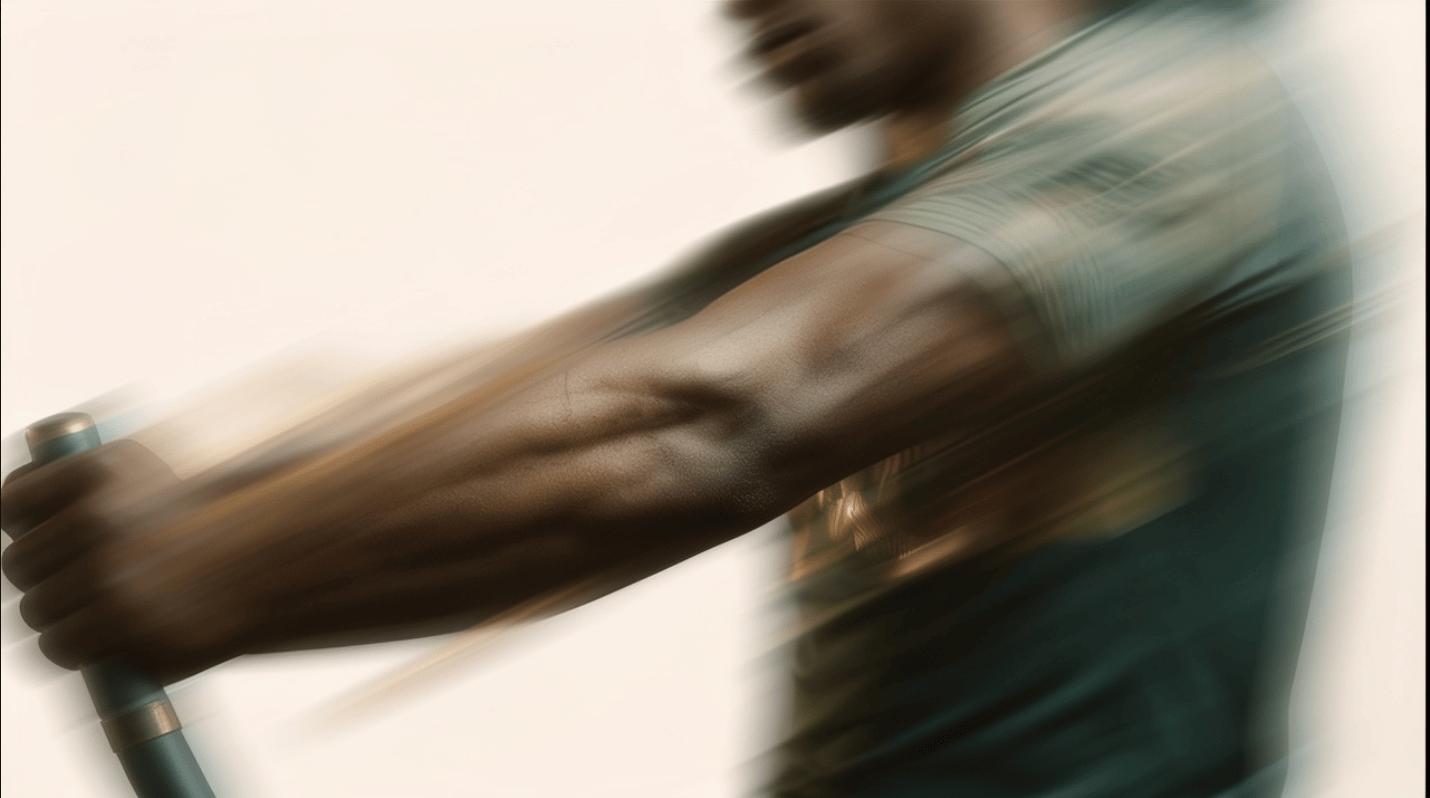
At its core, VOA is designed around people. Every solution supports individual needs, helping facilities create more engaging environments, coaches deliver more effective support, and users feel confident throughout their workout journey.
Through evidence-based innovation, smart design, and connected experiences, VOA makes fitness more approachable, adaptable, and sustainable — helping more people move stronger, longer, and with greater confidence.
01 Brand Strategy
02 Logo
The VOA logo is a refined expression of movement, connection, and direction. Built around clean, modern forms, it reflects the idea of progress and flow—a brand designed to guide people forward in their workout journey.
Its structure is precise and controlled, communicating clarity, trust, and technical confidence. Subtle curvature introduces a sense of fluidity and human movement, balancing the engineered nature of the system with a more approachable, dynamic feel.
More than a symbol, the VOA logo represents a connected ecosystem—bringing together operators, coaches, and users through a shared focus on smarter, more adaptable fitness experiences.
Primary Lockup
Alt Colour
Secondary Lockups
Reduced


Icon

03 Color
VOA’s colour palette is designed to communicate clarity, trust, and a more human approach to connected fitness. It balances technical precision with warmth, ensuring the brand feels both advanced and approachable across every touchpoint.
Deep, grounded tones create stability and confidence, while lighter, more natural accents introduce energy, accessibility, and a sense of movement. Select accent colours support key moments of interaction, guiding focus and enhancing usability across digital and physical environments.
Together, the palette creates a cohesive system that feels intelligent, reliable, and designed for real-world workout environments.
Primary Palette
Hero — Digital
Hex: #96fcd4
GROUNDED
Hex: #253D39DF
CMYK: C41 M0 Y7 K76PANTONE: 5535 C
White
Hex: #F6F3F0
CMYK: C0 M1 Y2 K4
Pantone: 11-0601 TCX
Carbon
Hex: #2B2A2E
CMYK: C7 M9 Y0 K82
Pantone: 426 C
Secondary Palette
Hero — PANTONE
PANTONE 3775
Hero — CMYK
CMYK: C47 M0 Y35 K0
Chalk
Hex: #F0EDE5
CMYK: C0 M1 Y5 K6
Pantone: 11-0701 TCX
Recovery
Hex: #E2E0CE
CMYK: C0 M1 Y9 K11
Pantone: 7527 C
Headwind
Hex: #959EA8
CMYK: C11 M6 Y0 K34
Pantone: 5435 C
Slate
Hex: #696D72
CMYK: C8 M4 Y0 K55Pantone: Cool Gray 10 C
Pure Breath
Hex: #FFFFFF
CMYK: C0 M0 Y0 K0
Pure Carbon
Hex: #000000
CMYK: C0 M0 Y0 K100
Pantone: Black C
Gradient Palette
Gradient 1
Gradient 2

Gradient 3

Gradient 4
04 Typography
VOA uses a single typeface, Roobert, to create a unified and consistent visual language across all applications. Its clean, modern structure delivers clarity and precision, supporting both data-led interfaces and more expressive brand communications.
Typographic hierarchy is essential in creating structure and readability. Strong, confident headlines establish impact, while refined body copy ensures clarity and ease of understanding. Scale, spacing, and weight are used intentionally to guide attention and improve usability across complex information.
This system ensures VOA communicates with consistency and confidence — balancing technical clarity with a human, approachable tone.
Typographic hierarchy is essential in creating structure and readability. Strong, confident headlines establish impact, while refined body copy ensures clarity and ease of understanding. Scale, spacing, and weight are used intentionally to guide attention and improve usability across complex information.
This system ensures VOA communicates with consistency and confidence—balancing technical clarity with a human, approachable tone.
Primary Typeface
Roobert Regular
Sizing
Lorem ipsum dolor sit amet, consectetur adipiscing elit, sed do eiusmod tempor incididunt ut labore et dolore magna aliqua. Ut enim ad minim veniam, quis nostrud exercitation ullamco laboris nisi ut aliquip ex ea commodo consequat.
As part of our community, you’ll be among the first to discover the launches, innovations, and insights we’re unveiling to transform the strength training experience.
Type Sizes 0–24pt/px
130% Leading
0% Tracking
Change is
in the air
Type Sizes 24–55pt/px
120% Leading
10% Tracking
Get ready to experience strength training as you’ve never felt it before.
Type Sizes 55–72pt/px
110% Leading
-2% Tracking
Change is in the air
Type Sizes > 72pt/px
100% Leading
-2% Tracking
05 Art Direction
VOA’s art direction reflects the brand’s core principles of trust, clarity, and connected fitness. Imagery focuses on real environments, real movement, and real users — capturing the experience of training through intelligent, evidence-based systems.
Visuals balance technical precision with human energy, ensuring the brand feels both advanced and accessible. Lighting, composition, and framing are used to create a sense of control, clarity, and progression across every application.
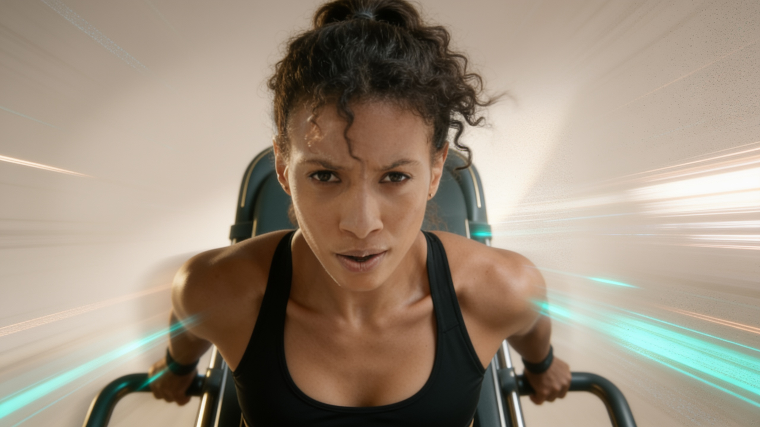
Human in Motion
Photography captures real movement and interaction during workouts. Subtle blur, natural expressions, and dynamic framing communicate effort, flow, and engagement.
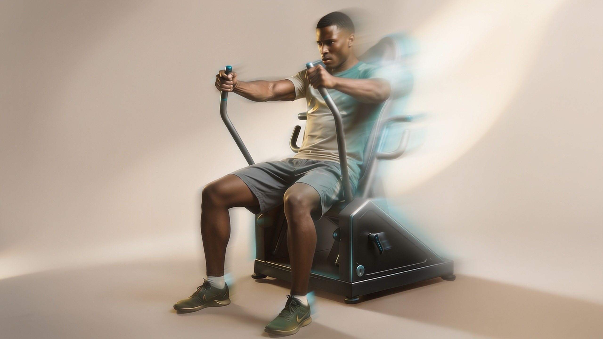
Human in Motion
Photography captures real movement and interaction during workouts. Subtle blur, natural expressions, and dynamic framing communicate effort, flow, and engagement.
Connected Ecosystem
Scenes show the relationship between users, coaches, and equipment. The focus is on interaction, guidance, and support within a connected workout environment.
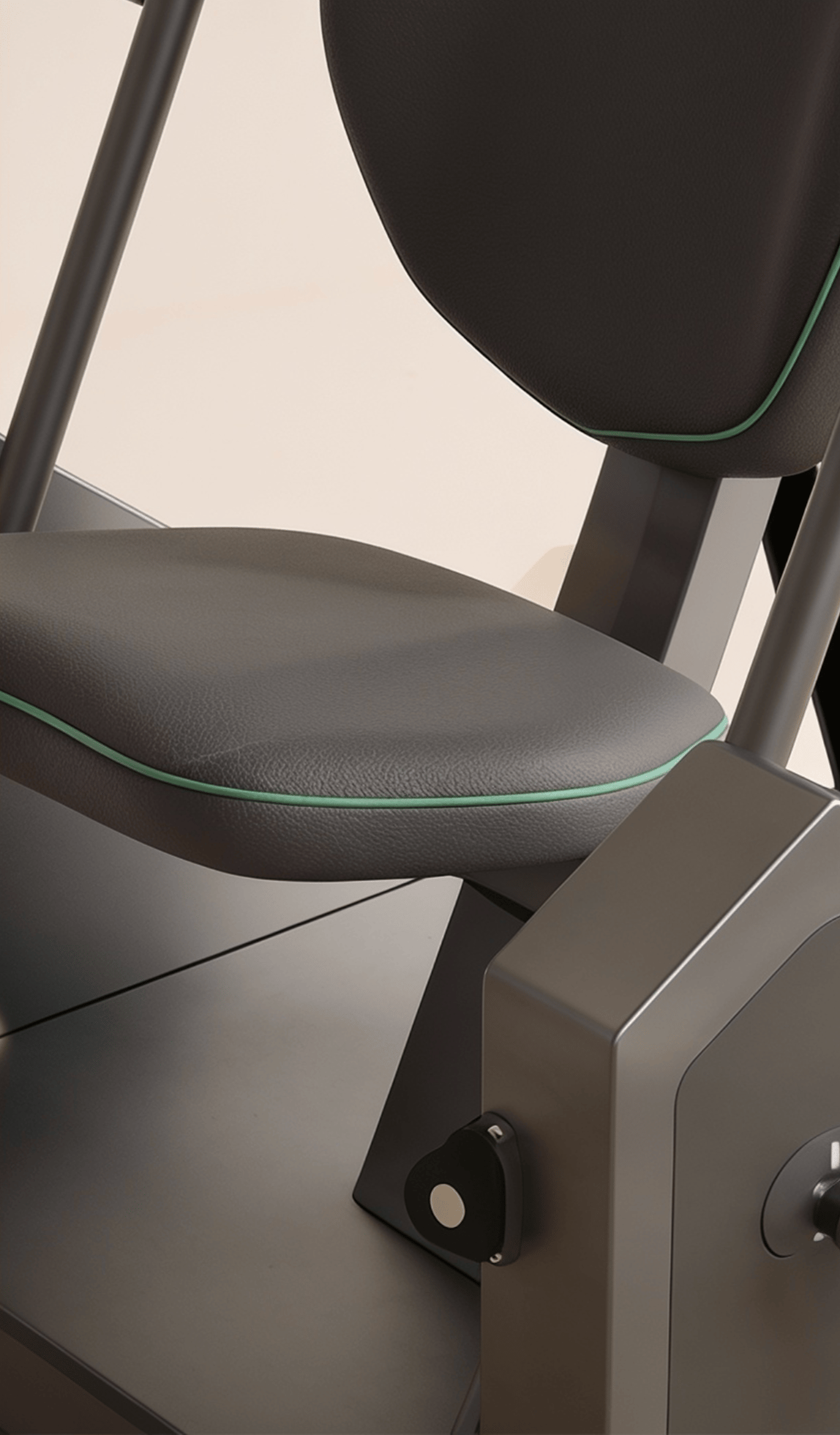
Product Precision
Hero product imagery is clean, detailed, and highly controlled. Lighting and composition highlight engineering, materiality, and usability, ensuring clarity and trust in the equipment itself.